The beauty of science is that it’s constantly evolving—old knowledge is replaced with newer, more accurate understandings. We strive to apply the same methodology to all of the exhibits in Science World, not only to stay relevant, but to enhance our visitor experience.
More recently, our BodyWorks Gallery underwent a much needed upgrade, updating the content and the look of the exhibits. So what does it take to rebuild exhibits at Science World? Read about the process below.
Research up-to-date science content
First, our gallery curator, Friderike Moon, conducts research to ensure our science content is current and accessible. She also determines the appropriate “voice” for the text – should the tone be playful or serious? An important question to ask when choosing this voice is who is the audience for this content?
Get an expert to create new copy
Once the voice has been determined, the next step is to engage an expert writer to create new label copy (the text on the panels that accompanies the exhibits). For this particular gallery, we asked Raymond Nakamura, a writer and frequent Science World collaborator, to take on this job..
Rejuvenate the exhibits
After the copy has been written, we turn our attention to the design of the exhibits within the gallery. Every time we bring new exhibits onto the floor, we prototype the heck out of them to make sure that they’re accessible, easy to use and durable. In the case of BodyWorks, our human performance exhibits were already well-tested, having already been around for 16 years– so why fix what isn’t broken?
We decided that the exhibits only needed a rejuvenation, with minor tweaks here and there to ensure the exhibits operate as smoothly as possible for our guests. We also wanted to give the exhibits a new look. This was still a substantial task for our workshop team, who had to disassemble all of the exhibit pieces, send them out for modifications, upgrade the exhibits’ inner workings and finally reassemble them.
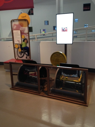
Out with the brown…
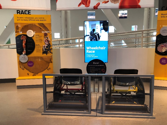
… and in with the sleek, stylish grey
Update the graphics
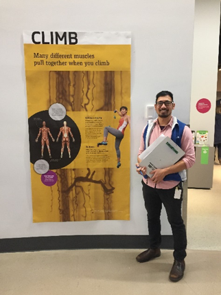
The BodyWorks Gallery opened 16 years ago, so the graphics were a bit out of date. Our graphic designer, Chihiro, created new layouts based on the new BodyWorks identity (the colour palette, fonts, logo and overall feel of the gallery) that was established last year.
Since the majority of the exhibit experiences had already been developed, we really got a chance to flex our prototyping muscles for developing the graphics. This meant taking our preliminary layouts onto the floor, gathering data about how they were being read and then using this visitor feedback to adjust how we would refine and produce these graphics.
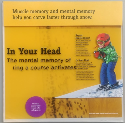
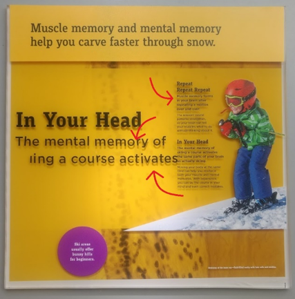
Our first shot at a layout. The question to our visitors here is: “what do you think is the most important message in this graphic?”
After visitor testing, we knew what we wanted the graphic panels to look like. The next step was to figure out how to bring them to life.
Prototype print production
When prototyping for exhibits and graphics, it’s important to be able to respond quickly to any flaws that come up in each of the iterations. This can really save headaches in the future. What if we discovered an error across all the graphics but had already pressed “print” on the final versions? We can circumvent that with some test prints!
First round of testing:
It looks good overall, but the text is a bit hard to read along the middle band and the strip of yellow across the middle where the arrows are pointing is just a bit off from our colour palette. Time for a second iteration!
Second round of testing:
Looks great—at first glance. The increased opacity along the middle makes it easier to read. But we have to consider how easy it will be to read the panels once they’re installed. How would they look with a bit of focused lighting?
Third round of testing:
A little bit of light directed onto the panels creates pesky drop shadows, making the panels difficult to read and almost blurs the text. Fortunately, our designers have a sharp eye for these kinds of things.
Fourth round of testing:
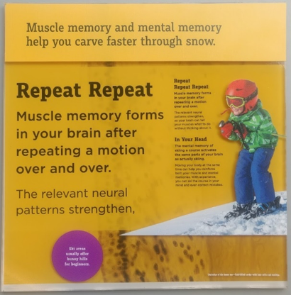
Once we moved the printed text to the back layer, the result was crisp, legible graphics that will hold up well within the gallery space.
Put it all back together
With the graphics done, the last pieces fell into place and our Workshop team reassembled the exhibits and graphics. The transformation is quite impressive!
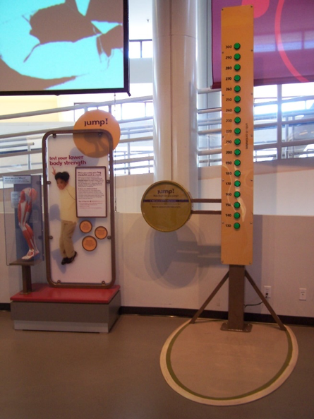
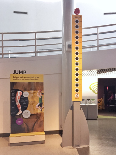
The Jump Exhibit, 2004 vs. 2018
Like any good design, we employed an iterative process to find the strengths and pitfalls of each decision that we made. The result is an excellent gallery space, with relevant science that our guests can easily grasp through engaging and interactive exhibits.
Check out our newly upgraded BodyWorks Human Performance exhibits at Science World and tell us what you think!